Design Client Work
Brand Identity

Equestrian Up Next
Our team worked alongside an incoming brand, Equestrian Up Next, to develop a brand identity guide and accompanying logo for Jayne Hunter’s new website currently in development, which will serve as a one-stop-shop for all things horses: tack and horses for sale, shows and competitions in the area, community forums, and more!

Justice to Healing
Our team developed a logo for the National Drug Court Resouce Center’s podcast called Justice to Healing that explores alternative approaches to be used by treatment court practitioners.

Eastern Communication Association Conference
In 2019, Pier601 parterned with ECA to design logos and iconography paired with unique typography and color palettes to reflect the conference location, Cambridge University, and theme of resilience. We created multiple moodboards and incorporated elements of Cambridge University to add layers of history and personality in all designs.
Website Design

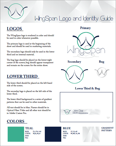
WingSpan
WingSpan is a political television show that is the result of a major applied learning collaboration within the Communication Studies Department of the University of North Carolina Wilmington. Pier601 was responsible for the logo, as well as the brand and visual identity of the show, which included deciding the font and color scheme.
Our team helped WingSpan to construct their brand in its earliest stages. Below is an example of a Pier601 brand identity guide developed to solidify the WingSpan brand. Nobody likes an identity crisis.
A BRAND NEW IDENTITY


Association for Communication Administration
The Association for Communication Administration is an organization that is geared towards exploring communication in higher education. In Spring 2017, we brought on ACA as a client to enhance their visual identity. Following the Association's visual identity, the team of creatives at Pier601 designed an engaging website to be the digital face of the organization.
Document Design
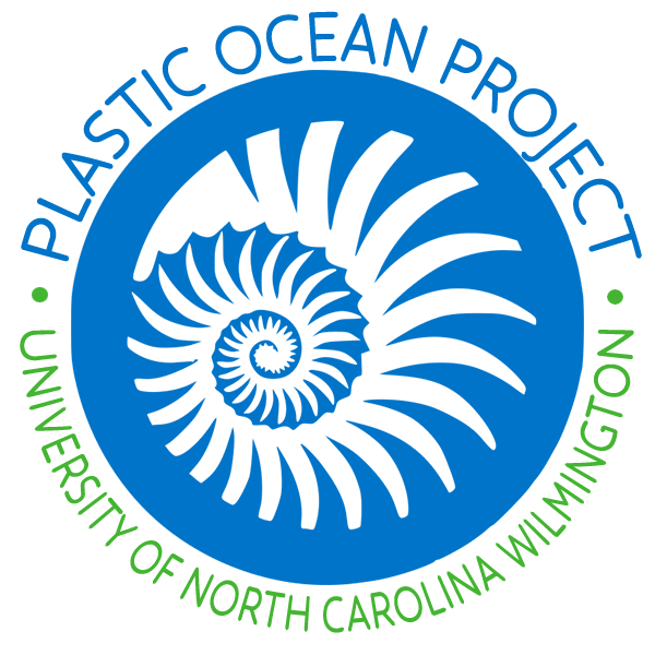
Plastic Ocean Project
The Plastic Ocean Project is a nonprofit organization whose mission is to educate, incubate solutions, and implement outreach initiatives to address global plastic pollution problems. Pier 601 Creative worked with “POP” to create a brochure that would help inform potential partners about the mission and capabilities of the organization. The brochure implements the brand aesthetic and voice to cover the organizational mission and call to action.

